
In this article, we will introduce you to some of the exciting new design elements of the fresh and updated interface.
The menu:
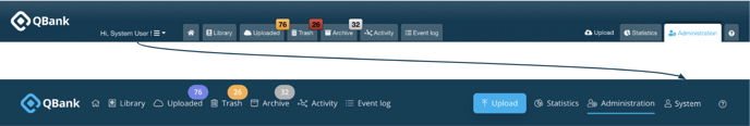
The top menu has been redesigned to give it a fresh and modern appearance. We have replaced the outdated tabs with a sleek and lightweight menu that only includes text. ![]()
Some small changes in the menu
To enhance the user-friendliness of the menu, we have made a small change in its layout. The user tab has now been moved from the left side to the right, aligning with standard design practices. This update follows common design principles and aims to provide a more intuitive and seamless navigation experience for our users.
The rest of QBank
The rest of the Library has also received general updates in terms of design. These updates have given the interface a more visually appealing and lighter look, while also adding a modern touch to the icons. These changes aim to enhance the overall user experience and make navigating through the Qbank more intuitive and seamless.
Here are some introductions to the new interface:
The assets in the library now have a more visually appealing and lighter interface, making it easier and more enjoyable to navigate through.

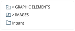
The left menu has also been updated to have a more visually appealing and user-friendly design. The folders and filter folders are now presented in a clearer and more organized manner, making it easier for users to navigate and find what they need.

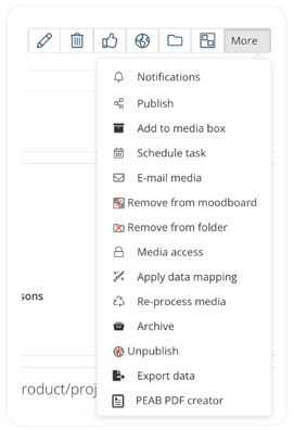
The icons in the Library have also been updated to follow common design elements, giving them a more visually appealing look. The new design adds a touch of elegance and enhances the overall aesthetic of the interface.
Furthermore, it is important to note that the icons in the interface have different colors to indicate their clickability. Non-clickable icons are displayed in a light grey color, while enabled buttons are shown in a dark blue color. This color distinction helps users easily identify which icons can be interacted with and enhances the overall usability of the interface.

![]()
The filter bar has also been updated to align with the rest of the interface, providing a cohesive and seamless design experience.

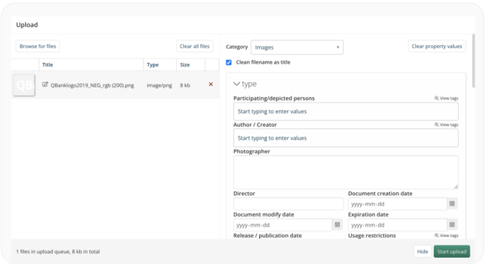
Lastly, the upload window has also been updated with the same lightweight design as the rest of the interface. This ensures consistency throughout the platform and provides a seamless and visually appealing experience for users when uploading files.
NOTE: Please note that only the editorial sections of QBank have been updated with the new interface. The administrative sections still retain the old interface design.
If you would like to enable the new interface, we recommend checking out this article for more information.