Turn on the new UI!
We have released the new UI of QBank, this article will show how an administrator for your organization can turn on the new UI in your organizations QBank.
NOTE: Please note that only Administrators have the ability to make the necessary configurations to enable the new UI.
NOTE: Enabling the new UI will result in a change for all users, not just for you.

To enable the new UI, you must access the administrator view in your QBank and make the necessary configurations. This will switch the old UI to the new one for your organization's QBank. Remember, only Administrators have the ability to make these changes, and once enabled, the new UI will be applied to all users, not just yourself.
Learn more about the updates made in the new UI.
Follow these steps:
- Go to the Administrator Tab and access the settings option in the left menu.
- In the "Customize interface" section, select "QBank 5" from the GUI version dropdown menu.

- After refreshing the page, you will be able to access the new graphical user interface (GUI) in your QBank.
NOTE: The new graphical user interface (GUI) is only applied to your Library and not to the Administrator pages.
If you are an administrator and cannot find the Settings option in the left menu, there's no need to worry. Simply reach out to our support team, and we will assist you in gaining the appropriate access.
Why not personalize the appearance and design while you're at it?
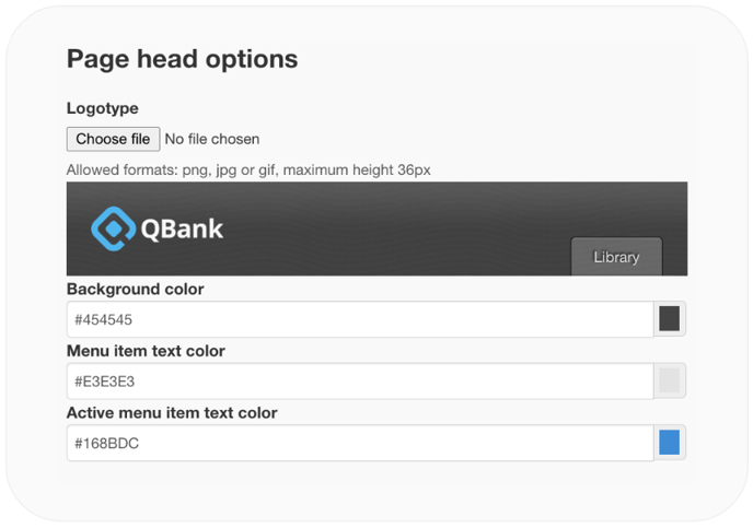
In the same "Customize interface" section, you also have the option to personalize your header's color and include your organization's logo. This allows you to further customize the appearance and branding of your QBank interface.

- You have the option to upload your organization's logo in the "Logotype" section. Please keep in mind that the logo should have a maximum height of 36 pixels and be in the format of png, jpg, or gif.
- The "Background color" refers to the color of the header at the top of your interface. If you choose a dark-colored header, please remember to upload a logo with inverted colors to ensure maximum accessibility.
- The "Menu item text color" in the new interface refers to the color of the text displayed in the menu. It is important to choose a contrasting color from the header to ensure optimal visibility. This is slightly different from the previous UI, where the menu had tabs. In the new interface, visibility becomes even more crucial.
- The "Active menu item color" in the new Interface refers to the color that indicates which menu item is currently selected. It is also the color of the upload button. This helps users easily identify their selection and locate the upload button.
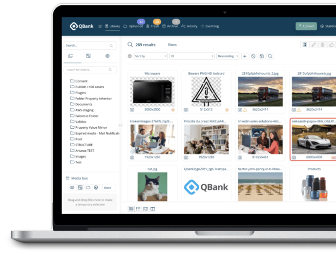
Discover the new and improved interface!
While all functionalities remain the same, we have given the look and feel a refreshing update. Experience a more modern and user-friendly interface that enhances your QBank experience.
Here you can read more about some selected design changes that have been done in the updated interface.
